

鮮嫩彈牙的肉質,伴隨淡淡的深海鹹味,彷彿身處海上餐廳,美味在齒間跳動,食材的鮮甜原味也在口中逐漸蔓延。春花秋實秉持對餐飲服務的熱忱與多年的實務經驗,提供消費者以高貴不貴的價格,享受高品質且安心健康的海味食光,掀起消費者味蕾新感受。
品牌名稱中的字首「春」為創意主軸,以水墨筆法繪製圓弧狀象徵鍋物,現代簡約的線條解構與濃厚的書法中文字體結合,並將春花秋實中的英文縮寫C.H.Q.S,其字母筆畫隱藏於logo之中,使品牌具有獨特的解讀性,充分表達出東方鍋物文化的意涵。而右上方的英文字,則代表該品牌的讀音,讓品牌更具國際化。
色彩概念代表著品牌精神,藍色象徵新鮮海產,為飽享海味的饗宴;金色象徵精緻高貴,為細膩尊榮的款待;黑色象徵嚴謹真樸,為究極新鮮的堅持。主要輔助視覺以新鮮現撈的海產,用水墨拓印手法呈現,與品牌識別上的書法字體呼應,銓釋品牌對於頂尖新鮮食材的嚴格要求。另外,以鍋底形狀簡化為一個圓和把手,與不同的海洋波形與日式圖紋結合,象徵以鍋物料理為特色的核心。濃烈的水墨拓印搭配現代簡約的幾何線條,融合具象的海鮮食材與虛實之間的波浪,彰顯日式鍋物品牌其真樸、人文、極致風雅的風格與氣度。
Fresh delicate meat which accompany with taste of the sea, it is just like you are in the restaurant which nearby the sea when having meals. CCHS insists on giving the best service to customers with passions and honest attitude. They offer a reasonable price, high quality and health food.
The first word “Spring” in the brand is the foundational concept, the arc-shaped figure is drawn with a Chinese ink wash style to symbolize a pot. Combining simplistic linear design and Chinese calligraphy to create the words.
Furthermore, we have hidden the English abbreviation of Chinese word, which is CHQS, into the logo creating a uniqueness in the brand to fully express oriental pot culture. The English words on the upper right represent the pronunciation of the brand’s name, making the brand more international. The color concept indicates spirit of brand. Blue is freshness, means feast of sea. Gold is nobility, means hospitality of the highest honor. Black is simplicity ,means persistence in freshness. The ink printmaking conveys the sensation of freshness in seafood corresponding to the calligraphy of the brand. In this manner, we show the brand’s commitment to freshness of ingredients.
In additions, the pot shape has been simplified to a semicircle with handles combined with wave shapes and Japanese-style patterns to symbolize the characteristics of the ingredients in the pot. The dense ink printmaking combined with geometric shapes and waves elements illustrate the Japanese pot’s simplicity, sincerity, elegance, and style.
希望能創造一個秘境,領我們離開喧囂,並在山谷裡忘我地饗食人生。
[崖穴]
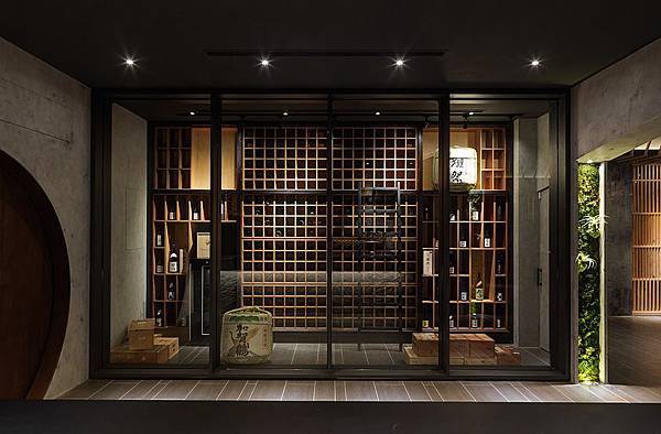
從山壁進入崖穴,中介空間中運用天花造型、方、圓錯層的牆面,創造出豁然開朗的用餐秘境。
[秘林]
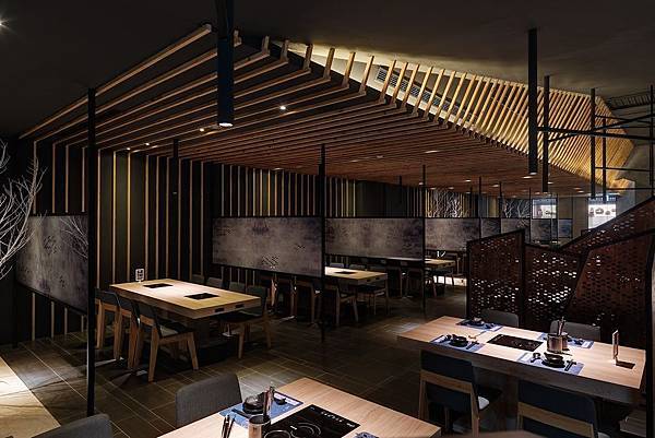
室內元素中,利用此起彼落的黑管燈、樹影般的孔洞屏風,營造出有如如林中饗食之景象,在之間穿過一條白沙溪流,溪流裡有著切片式的假石,呼應著有如水墨畫的包廂牆面,彷彿置身在湖光山色的風景中。
[洞視]
在包廂透過有如夢境般的漸層圓洞,安靜地出現枯枝造景,又隱約的出現動態地人影交會,人與景成為空間中最美的一幅畫。
[遠山]
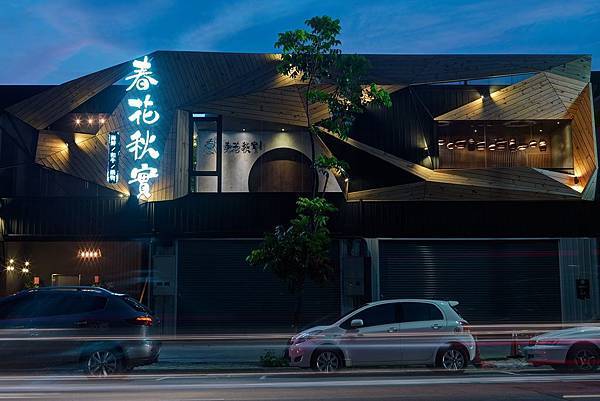
室外立面運用實木與鐵網折板虛實交錯,創造出曲折山壁,在這山壁之中,出現有如進入秘境的圓洞,引領入室。
| 主要材料 |
玻璃貼UV白墨輸出、仿水泥塗料、七夾角料、鐵件、運輸帶、苔癬、自然面石頭、九芎木枯枝、白砂。
---------------------
參閱更多美好作品
www.holycow.com.tw


 留言列表
留言列表