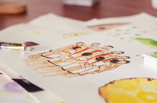
標準字的部分以重新解構文字,再以原住民特有的編織特色來增添標誌的獨特性,並在局部延伸將山林與布農圖騰的三角元素融入,使之形成獨具原住民特色的標誌。色彩上以孕育稻米生長的土地為概念,使用土色及金色,象徵著純淨的土地,所孕育出的好米。在包裝上,以水彩感的插畫,畫出布農族特有的八部合音,並加入畫曆的元素,以溫暖的色調呈現,使消費者可以藉由包裝感受原住民的溫暖活力,使部落米更具個別特色。


Using the features of aborigines, weave, Gunther and mountain to the design. It is just like nature in the logo. For the color, we take gold and the color of land to symbolize the pure land which also means this land would produce good crop. For the package design, we take the features of Aboriginal Music of Bunun Tribe and also the unique calendar into it to let the customers feel the passion of the aborigines.
更多美麗作品
全站熱搜


 留言列表
留言列表